
Using Web Components: A Quick Guide
This guide provides the best practices for building consistent and user-friendly pages with our web components.
- Select the right component for your content.
- Styles: Some components have different display styles. For example, the Quote component has a Grid and a Slider style.
- Deprecated Components: Older component versions are kept to ensure existing pages remain functional. Always use the new version of components whenever available.
Fundamentals
Action and Engagement
Dynamic Content
Media and Display
People and Identity
Page Headers
The two pages linked below are examples of how images should be used in page headers. In general, pages should use "overflow" images rather than "contained" images. The overflow image pushes the right margin of the body text to the left and keeps text line lengths shorter on desktop screens. This makes the text easier to read.
Header text should be as short as possible. Three lines is the ideal maximum length for header text.
Spacer
As of Q3 2025, components now have a standard space above and below them, which makes the Spacer component no longer a necessity for most layouts. It is now primarily used for custom adjustments when a default space does not create the desired visual relationship.
For example, the spacer can be used to reduce the distance between two related components to make them appear as a single unit or to add extra space between unrelated components to provide a clear visual break.
Typography
Use headings to organize and divide sections of information between the components.
- H1 headings - reserved exclusively for the main page title.
- H2 headings - used to break up content sections.
- Other heading sizes can be used for sub-sections.
For more details on typography, refer to the style guide: pacific.edu/brand
(H2)Heading
(H3) Heading
(H4) Heading
(H5) HEADING
(H6) HEADING
Tables
Tables can be used to organize information but should be used sparingly.
- Limit tables to a maximum of three columns. Tables with more columns will not display correctly on mobile devices.
- All tables should have a background color and be set to 100% width to match site styling.
For assistance in applying these styles, contact the web team.
| Fee | Notes | Cost Per Term |
|---|---|---|
| Wellness Center Fee | Per semester/term | $165 |
| Audiology Fee | Per semester/term | $400 |
Text Field component
Example: Structuring content with headings
A RUNNING HEADLINE (H6)
A section title heading (H2)
A sub-header; it should be short. Always in sentence case, never ALL CAPS (H4)
This is our paragraph style. When applied in-line text links appeared in this color. Occasionally, a special Component Link is available. It would show under the paragraph with its own style and sometimes accompanied by an arrow.
Accordion Content component
Accordion Content components use Midnight Blue background for three or fewer sections, and a Porcelain (Light-gray) background for more than three. To maintain usability, they should not be overly long or used for FAQ pages. If an accordion has more than seven sections or large amounts of content, consider using a standard text component or a dedicated page instead. Each section's title must be in sentence case and fit on a single line on desktop.
Usage guidelines
- The title text for accordions should be sentence case, and fit on one line in desktop view.
- There is an optional accordion headline for groups of accordions.
Three or fewer accordions
Duis enim arcu, blandit eu lorem at, viverra porttitor nunc. Suspendisse potenti. Donec vel odio non velit fringilla varius vitae vitae nulla. Duis in dictum turpis, in pharetra diam. Nullam lacinia efficitur pretium. Nunc vulputate felis in facilisis efficitur. In rhoncus, velit eget posuere ultrices, tortor velit hendrerit lorem, a viverra magna risus id nibh.
- Enim arcu, blandit eu lorem at, viverra porttitor nunc. Suspendisse potenti.
- Aspendisse potenti. Donec vel odio non velit fringilla varius vitae vitae nulla.
Multiple accordions
Duis enim arcu, blandit eu lorem at, viverra porttitor nunc. Suspendisse potenti. Donec vel odio non velit fringilla varius vitae vitae nulla. Duis in dictum turpis, in pharetra diam. Nullam lacinia efficitur pretium. Nunc vulputate felis in facilisis efficitur. In rhoncus, velit eget posuere ultrices, tortor velit hendrerit lorem, a viverra magna risus id nibh.
- Enim arcu, blandit eu lorem at, viverra porttitor nunc. Suspendisse potenti.
- Aspendisse potenti. Donec vel odio non velit fringilla varius vitae vitae nulla.
Accordion Links component
The Accordion Links component is a great way to display a concise list of links without cluttering the page. It's designed to save space by collapsing the links under a single, expandable title. Because you can only include a title and the link text—and not descriptive text—this component is ideal for organizing supplemental resources or related pages.
Multi-Column Text component
The multi-column text grid component creates a two or three column text layout for desktop views, with columns automatically stacking on mobile devices. This component is not intended for single-column text. For a more balanced visual appearance, each text section should contain a similar amount of content. If similar character counts are not possible or if your intention is to have single-column it is better to use a Text Field component.
Background can be set to either White or Porcelain (Light-gray).
Two-column section title
Column title
Lorem ipsum dolor sit amet consectetur. Dolor luctus ut imperdiet enim sed odio lorem pellentesque arcu. Eget eu tellus scelerisque etiam euismod adipiscing cursus. Tortor urna sed nisl pulvinar eu.
Column title
Lorem ipsum dolor sit amet consectetur. Dolor luctus ut imperdiet enim sed odio lorem pellentesque arcu. Eget eu tellus scelerisque etiam euismod adipiscing cursus. Tortor urna sed nisl pulvinar eu.
Three-column section title
Column title
Lorem ipsum dolor sit amet consectetur. Dolor luctus ut imperdiet enim sed odio lorem pellentesque arcu. Eget eu tellus scelerisque etiam euismod adipiscing cursus. Tortor urna sed nisl pulvinar eu.
Column title
Lorem ipsum dolor sit amet consectetur. Dolor luctus ut imperdiet enim sed odio lorem pellentesque arcu. Eget eu tellus scelerisque etiam euismod adipiscing cursus. Tortor urna sed nisl pulvinar eu.
Column title
Lorem ipsum dolor sit amet consectetur. Dolor luctus ut imperdiet enim sed odio lorem pellentesque arcu. Eget eu tellus scelerisque etiam euismod adipiscing cursus. Tortor urna sed nisl pulvinar eu.
Multi-Column Text with Images component
This component builds a multi-column layout for both text and images, offering a two or three column arrangement that adjusts to a single column on mobile devices. A dedicated image space is included in each column, with the image size automatically adjusting based on the number of columns used.
Background can be set to either White or Porcelain (Light-gray).
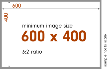
For best results, use images with a minimum size of 600x400.

Column title
Lorem ipsum dolor sit amet, consectetur adipiscing elit, sed do eiusmod tempor incididunt ut labore et dolore magna aliqua. Ut enim ad minim veniam.
Component Link
Column title
Lorem ipsum dolor sit amet, consectetur adipiscing elit, sed do eiusmod tempor incididunt ut labore et dolore magna aliqua. Ut enim ad minim veniam.
Component Link
Column Title
Lorem ipsum dolor sit amet, consectetur adipiscing elit, sed do eiusmod tempor incididunt ut labore et dolore magna aliqua. Ut enim ad minim veniam.
Component Link
Column title
Lorem ipsum dolor sit amet, consectetur adipiscing elit, sed do eiusmod tempor incididunt ut labore et dolore magna aliqua. Ut enim ad minim veniam.
Component Link
Column Title
Lorem ipsum dolor sit amet, consectetur adipiscing elit, sed do eiusmod tempor incididunt ut labore et dolore magna aliqua. Ut enim ad minim veniam.
Component LinkQuotes
This component is particularly well-suited for featuring quotes with accompanying headshots - the photo is a required field.
Style options
- Quote Grid style: This style displays images larger in a grid layout. It's best suited for a small number of quotes, typically around four, where you want the images to be more prominent.
- Quote Slider style: This style is designed to accommodate multiple quotes. The images are smaller, and the quotes are displayed in a slider format, making it easy for users to browse through a larger selection.
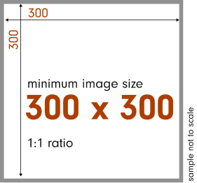
For best results, use images with a minimum size of 300x300.

Magna ac placerat vestibulum lectus mauris ultrices eros. A condimentum vitae sapien pellentesque habitant morbi tristique senectus.

Magna ac placerat vestibulum lectus mauris ultrices eros. A condimentum vitae sapien pellentesque habitant morbi tristique senectus.

Magna ac placerat vestibulum lectus mauris ultrices eros. A condimentum vitae sapien pellentesque habitant morbi tristique senectus.
Magna ac placerat vestibulum lectus mauris ultrices eros. A condimentum vitae sapien pellentesque habitant morbi tristique senectus.

Magna ac placerat vestibulum lectus mauris ultrices eros. A condimentum vitae sapien pellentesque habitant morbi tristique senectus.
Magna ac placerat vestibulum lectus mauris ultrices eros. A condimentum vitae sapien pellentesque habitant morbi tristique senectus.
Highlight Section component
This component highlights important facts and can display one, two, or three columns of text.
Usage guidelines
- This component is preferably used for highlights on academic pages.
- For readability, each column should contain 60 characters or less.
- A minimum of two columns is recommended.
- Background options are Deep Orange/700, Canary (Yellow), and Driftwood.
Education enhances critical thinking and empowers societal contributions.
Education enhances critical thinking and empowers societal contributions.
Education enhances critical thinking and empowers societal contributions.
Education enhances critical thinking and empowers societal contributions.
Education enhances critical thinking and empowers societal contributions.
Education enhances critical thinking and empowers societal contributions.
Three-Column CTA component
This component highlights key information and can include a Call-to-Action button or buttons. The content areas are smaller, so it's best to use concise titles and text. The component supports up to multiple button links, though one or two are recommended for optimal results.
Component's Title
The header should be less than three lines high. The text field should be limited to 300 characters or less. And there should be no more than three links featured.
Two-Column Button List component
This component provides another way to display a list of links. Titles can be placed over both columns, a single column, or neither. It also has two available styles, Default and Alternate, with an alternate format toggled by a checkbox within the component's fields.
Style options
- Default Style: Dark Orange/600 background with Midnight Blue buttons
- Alternate Style: Midnight Blue background with Dark Orange/600 buttons

Two-Column List and Buttons
This component displays a list of items and button links. Because the list items themselves are not clickable, this pattern can lead to "dead clicks" and user confusion. Use this component with caution and ensure the button names are action driven.
List Items


Directory Card List component
This component displays a group of directory cards. The content of each card is limited to an individual's photo, name, and title, with a link to view their full profile.
Usage guidelines
- Simply select the names of the individuals you wish to display.
- Content is sourced from the active directory, ensuring consistency and accuracy.


Directory Bios List component
This component displays a group of complete individual profiles, including their photo, name, title, contact information, and biography.
Usage guidelines
- Simply select the names of the individuals you wish to display.
- Content is sourced from the active directory, ensuring consistency and accuracy.


Quick Facts component
This component is designed to spotlight key numerical data or statistics.
The Quick Facts component features up to four statistics that are displayed in a single row on desktop and as a tap-and-drag carousel on mobile. To maintain visual integrity across all devices, it is critical that numbers are limited to three digits. Longer figures may be truncated or overlap on smaller screens.
statistic caption goes here
statistic caption goes here
thousand
statistic caption goes here
statistic caption goes here
Two-Column Callout component
The most popular, versatile component
The component supports a wide range of content types, including text, images, videos, Google Maps integration, and buttons.
To ensure visual consistency, avoid placing Spacers between consecutive Two-Column Callout components. This practice can disrupt the page flow by creating unwanted blank spaces on mobile devices.
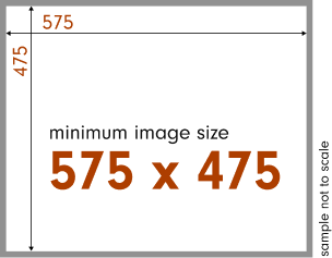
Images will be cropped to 575x475. For best results, upload images larger than these dimensions.

Focused to spotlight a single piece of media.
To ensure visual balance, limit a single column to one photo or video. Keep the accompanying text concise, with a height that is proportionate to the media, and include no more than one or two component links.
This component is designed to feature content in two columns, with the ability to alternate the placement of images and text.
Alternating the position of content—for example, image on the left, then on the right—creates a balanced and visually engaging layout that guides a user's eye down the page.

Two-Column Callout versatility
- The component can be used to feature side-by-side photos.
- It also supports large yellow or photo buttons. A single column should be limited to a maximum of three buttons.
- This component can support video. A cover image is required to visually introduce the video.
- It also supports Google Maps integration.


It is recommended that no more than three yellow button links be used in a single column.


It is recommended that no more than three image buttons links be used in a single column.
The Two-column component supports YouTube video embeds that launch in an expanded lightbox view upon selection.
A cover image is required to visually introduce the video and trigger playback when selected.

The Two-column component provides a direct and simple way to integrate Google Maps. This feature is designed to effortlessly pin and display a specific location on the page.
Carousel component
The Carousel component is a slideshow designed for visual storytelling with multiple photos, each supported by a title and caption. It should never be used to convey critical information, as users may not click through all slides.
Usage guidelines
- Slide Limit: Each carousel should be limited to a maximum of 5 slides.
- Formatting: All photos must be horizontally formatted to ensure visual harmony. Images can be positioned to the left or right of the text box.
- Character Limits: The title field is limited to 25 characters, and the caption field is limited to 100 characters. Adhering to these limits is essential for a consistent and clean user experience.
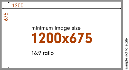
For best results, use images with a minimum size of 1200x675.

Carousel first title
The Carousel is a slideshow for visual storytelling, displaying photos with accompanying text. Because users may not view all slides, it should not be used for critical information.

Carousel second title
The Carousel is a slideshow for visual storytelling, displaying photos with accompanying text. Because users may not view all slides, it should not be used for critical information.

Carousel third title
The Carousel is a slideshow for visual storytelling, displaying photos with accompanying text. Because users may not view all slides, it should not be used for critical information.
Carousel first title
The Carousel is a slideshow for visual storytelling, displaying photos with accompanying text. Because users may not view all slides, it should not be used for critical information.
Carousel second title
The Carousel is a slideshow for visual storytelling, displaying photos with accompanying text. Because users may not view all slides, it should not be used for critical information.
Carousel third title
The Carousel is a slideshow for visual storytelling, displaying photos with accompanying text. Because users may not view all slides, it should not be used for critical information.
Carousel Slider
The Carousel Slider is an interactive component designed for visually enhanced storytelling. It presents a unique, horizontally displayed collection of images that users can flip to reveal a brief description on the back.
- The Carousel Slider is currently a style option found under the main Carousel component.
- Note: There are plans to make this a standalone component in the future.
For best results, use images with a minimum size of 1200x675.


Carousel (DAM Generated) component
A carousel that automatically pulls and showcases images directly from our Digital Asset Management (DAM) system.
Usage guidelines
- A complete guide for this component is available on the Website Resources SharePoint site.


Large Image CTA component
Designed as a large-format Call-to-Action, this component pairs a hero image with a prominent link.
Usage guidelines
- The image, link, and link text fields are all required to display the component on the page.
- While a subtitle or category field is available in the content editor, it does not render on the live page and should not be used.
- A landscape (horizontal) image is required. The recommended width is 1200px.
For best results, use images with a minimum size of 1200x675.

Video (Full-width)
The Video (Full-width) component features a video that spans the full width of the page. When clicked, a lightbox appears to showcase the video.
Usage guidelines
- The component requires a valid YouTube link to embed the video.
- Provide a placeholder image that accurately represents the video's content.
- Ensure the placeholder image is clean and free of competing elements, such as a logo, so that the Watch Video button remains the primary focus.
For best results, use images with a minimum size of 1200x675.
Big university choices with small college caring

Large Text CTA component
The Large Text CTA is designed to feature a single, concise statement for an impactful message. This component can be used with or without a link.
Usage guidelines
- The component is limited to a maximum of 75 characters, including spaces.
- For emphasis, a single word may be underlined. Highlighting multiple words is not recommended.
- The component supports Driftwood or Deep Orange background options.
Driftwood background, featuring a component link and an underlined word.
Deep Orange background, featuring a component link and an underlined word.
Text and Image (Scrolling Effect) component
One of the newest additions to our library, this component displays text over a background image that creates a dynamic parallax effect as a user scrolls. It is designed to help special pages stand out and serve as a visually impactful alternative to a Two-Column Callout when only text and a link are needed.
Usage guidelines
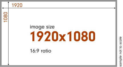
- The background image must be 1920px wide with a minimum height of 1080px to properly showcase the effect.
- Text content can be positioned on either the left or right side. It should be kept concise to ensure readability
- A light or dark overlay is placed over the image to help with text contrast and readability.
For best results, use images with a size of 1920x1080.
Component title
Proin dictum condimentum nulla quis aliquet. Nullam viverra bibendum libero et facilisis. In turpis lacus, tristique eu tristique in, imperdiet sodales lacus. This is a in-line text link.
| Column one | Column two | Column three |
|---|---|---|
| Data cell one | Data cell two | Data cell three |
- An unordered list
- With multiple items
- To test the typography
Proin dictum condimentum nulla quis aliquet. Nullam viverra bibendum libero et facilisis.
Component title
It all began with a trip to the supermarket when...... proin dictum condimentum nulla quis aliquet. Nullam viverra bibendum libero et facilisis. In turpis lacus, tristique eu tristique in, imperdiet sodales lacus. This is a in-line text link.An unordered list liquet. Nullam viverra bibendum libero et facilisis.
Content Reference component
Create once, use anywhere
This component allows you to manage content from a central location. It's designed for content that needs to be used on multiple pages, such as a contact block or a legal disclaimer.
Usage guidelines
- Content is built one time using the Content Reference component.
- To display the content on a page, simply add a Content Reference component and select the pre-built content item.
- When an update is needed, only the original Content Reference component content item is edited. Updates automatically appear on all pages where it is being used.
Deprecated components
Older component versions are kept to ensure existing pages remain functional. Always use the new version of components whenever available.